



Colour Symbolism and Meanings in Buddhism: A Guide
Colour Symbolism and Meanings in Buddhism: A Guide
Blue is supposed to mean wisdom in Buddhism. So why do two objects made within a century of each other use the same blue to say completely different things, one marking a teaching and the other guarding a doorway?
The colour charts you'll find online aren't wrong so much as unrooted. A colour in Buddhist art is evidence, and what it's evidence of depends on who made the object, where they made it, which pigment they had to hand, and what the object was for.
Reading that evidence takes patience and a lot of looking. Begin with the colours you meet most often, then test each one against real objects until the patterns and the exceptions both start to make sense.
Table of Contents
- Colour Meanings at a Glance
- Colour Myths That Mislead Collectors and Practitioners
- Hindu Colour Meanings Beside Buddhist Art
- Why Buddhist Colours Vary by Tradition and Place
- Regional Colour Variations from Tibet to Japan
- The Five Colours of the Vajrayana Buddha Families
- Reading Colour in Burmese Lacquerware
- How to Read and Display Colour in Sculptures
Colour Meanings at a Glance
Colour was never a finishing touch in Buddhist art. The Victoria and Albert Museum holds a sixth-century seated Buddha that was originally brightly coloured, with red and green pigment still surviving on the halo, and across early sculpture the painter's share of the work regularly outweighed the carver's. Meaning travelled through objects as much as through texts. The Manchester Museum's Vesak resource explains that colourful lanterns signify the light of the Buddha and his teachings, while lotus offerings stand for purity and spiritual potential.
The table below gives a first pass. Each row is a starting hypothesis that needs testing against the object in front of you, because a colour's meaning shifts with the tradition, the region and the job the object was made to do.
| Colour | Core Buddhist meaning | Hindu parallel | Where you see it |
|---|---|---|---|
| Saffron or ochre | Renunciation and monastic discipline | Bhagwa worn by renunciates and sadhus | Monastic robes, ascetic figures |
| Gold | Radiance of the awakened body | Divine prosperity, Lakshmi | Gilded statues, halos, thangka backgrounds |
| White | Purity and pacifying activity, Vairocana | Purity, Shiva and Saraswati | Calm deities, ritual scarves, ritual settings |
| Blue | Wisdom and the dharma, Akshobhya | Krishna and Vishnu, divine complexion | Avalokiteshvara hair, Triratna robes |
| Green | Active and repelling forces, Amoghasiddhi | Growth and fertility motifs | Tara figures, painted ground and ornament |
| Black | Wrathful protection and subduing activity | Kali and fierce forms of the goddess | Protector deities, fire-altar schemes |
| Red | Attracting activity, Amitabha and the Pure Land | Vermilion for auspiciousness, Durga and Devi | Painted deities, Amida robes, outer garments |
Read the rows in the order you will meet them.
- Saffron and ochre mark renunciation. The dye on a monastic robe was historically chosen for cheapness and local availability as much as for symbolism, and the renunciation reading settled on the colour afterwards.
- Gold signals the radiance of an awakened body. Gilded thangkas commonly set a gold Sakyamuni against a coloured halo and mandorla, so the metal reads as light given off by the figure.
- White belongs to calm and to pacifying activity, and identifies Vairocana in the five-family system. It appears on peaceful deities, ritual scarves and pale stone.
- Blue carries wisdom and the dharma itself, and marks Akshobhya. It recurs in Avalokiteshvara's hair and attributes, and in Britain it appears on ordination robes in some lineages.
- Green is the colour of active, repelling force and of Amoghasiddhi. Green Tara is the figure most readers meet first, usually shown with one leg extended as if about to move.
- Black belongs to wrathful protection and to destroying activity in Vajrayana ritual schemes, including the triangular hearth used in that rite.
- Red is attracting activity, Amitabha and the Pure Land. It also forms the outer layer of ordination robes in some communities, marking membership rather than doctrine.
These colours are usually read as a set rather than one at a time. The flag flown outside temples and at festivals combines them into stripes with a further band that merges the whole set, and the story behind World Buddhist Flag Day and the flag's design shows how the bands are meant to be held together rather than translated individually.
Identify the object first. Then check the row against its tradition and object type before assigning a meaning to anything.
Colour Myths That Mislead Collectors and Practitioners
The most expensive misreading isn't a wrong colour, it's the belief that a colour has one job. Britain alone holds Theravada, Mahayana and Vajrayana communities alongside culturally diverse Asian diasporas, and research on British Buddhism is explicit that there's no single British Buddhist colour code, because meanings depend on lineage and object context.
Each myth below comes with the question that replaces it.
- Blue always means wisdom. It can mark the dharma, identify Akshobhya, or, in Hindu imagery, describe Krishna and Vishnu. Ask: which figure is this, and what is it holding?
- Red means only power or protection. Red can be attracting activity, Amitabha, the Pure Land, service or plain religious affiliation. Ask: is the red on the body, the robe or the ground?
- Gold means wealth. On a Buddhist image gold usually signals the radiance of an awakened body; on a Hindu devotional image it can speak to prosperity and grace. Ask: whose image is it?
- Black means evil. In Vajrayana schemes black sits inside a protective, destroying function, not a moral one. Ask: what is the figure doing, and what is it standing on?
- Yellow always means the Middle Way. That's a simplification with no tradition or region attached. Ask: which system is in play here, doctrinal or ritual?
- A coloured spotlight makes a statue sacred. Lighting changes how a viewer perceives an object, not what the object means. Ask: what does it look like under neutral light?
Hindu Colour Meanings Beside Buddhist Art
Most British collections of Asian sculpture place Hindu and Buddhist pieces in the same room, and the same six colours do different work on each side. Knowing where the traditions overlap keeps you from importing a Buddhist reading onto a Durga or a Krishna.
Six readings you'll meet beside Buddhist art.
- Saffron and bhagwa. Worn by renunciates and sadhus, which runs parallel to Buddhist monastic saffron: both say the wearer has stepped out of ordinary household life. The similarity is real, and it's the closest the two traditions come on colour.
- Gold. In devotional images of Lakshmi, gold speaks to divine prosperity and grace. On a Buddha it says something narrower, the radiance of an awakened body, and that difference matters when you're cataloguing a gilded bronze.
- White. Associated with Saraswati's learning and with the ash-pale, ascetic imagery of Shiva. Buddhism uses white for calm and pacifying activity instead, so a white figure needs its attributes checked before either reading is applied.
- Blue. The divine complexion of Krishna and Vishnu, a skin colour rather than a symbolic attribute. Buddhist blue is doctrine and wisdom. Same hue, unrelated logic.
- Black and dark tones. Fierce forms of the goddess, above all Kali, where darkness is power and protection rather than menace. Vajrayana uses black for wrathful protection too, which is why the two get confused.
- Vermilion, or sindoor. Marks auspiciousness in marriage and in devotion to Devi and Durga. A red mark on a Hindu image is often a ritual application, not part of the original paint layer, so record it separately.
Practice varies by region and community, and household custom diverges from temple custom. Read in this order: identify the deity or the ritual first, then read the colour against that tradition. Never the other way round.
Why Buddhist Colours Vary by Tradition and Place
A colour in Buddhist art behaves like a word in a sentence. "Bank" is one thing beside a river and another in a ledger, and no dictionary entry settles which without the surrounding words. Blue in a thangka works the same way: it means what the figure wearing it, the gesture of the hands, the objects held and the workshop convention make it mean.
Three variables do most of the work.
Three variables that change the reading
Tradition comes first. Theravada countries apply colour mainly to robes and to gilded images. Vajrayana builds entire systems of five families with fixed activities. Mahayana traditions across East Asia use pigment to build hierarchy inside a painting, so the brightest colour is often the most important figure rather than the holiest one.
Region comes next. Tibetan, Sri Lankan, Southeast Asian, Chinese and Japanese workshops worked with different minerals, different trade routes and different doctrinal emphases, so the available palette itself carried assumptions. A pigment that was expensive in one place was ordinary in another, and price shapes emphasis.
Object type decides what the colour is doing. A statue, a painted thangka, a monastic robe and a lacquer vessel can carry the same hue to four different ends: identifying a figure, marking a direction or family, recording what the workshop could afford, or creating contrast so the central figure reads from across a hall.
Then there's the audience. In England and Wales, 272,508 people identified as Buddhist in the 2021 census, which the Office for National Statistics defines as religious affiliation rather than proof of belief or practice. A count of that kind tells you how many people ticked a box. It doesn't tell you they read colour the same way, and the traditions they belong to don't either.
The question to carry into a gallery: which Buddhist tradition and object type does this colour belong to, and what evidence supports that reading?
Regional Colour Variations from Tibet to Japan
A conservator standing in front of a Tibetan thangka, a Joseon hanging scroll and a Thai bronze is reading three different systems, even when the pigments came from the same mineral sources. The same five colours change jobs from one region to the next, because each work answers to its own workshop, lineage and patronage.
In the Himalayas, colour identifies a Buddha family and its activity, and the system is close to a grammar: a hue in a fixed position carries a fixed identification. Korea works differently. British Museum technical documentation shows Joseon Buddhist paintings commonly using green and red mineral pigments, so colour there is a material choice first and a symbolic one second. Japanese esoteric works combine gold leaf, vermilion outlines, dark blue, green, white and cinnabar to separate garments, attributes and facial detail, and in one documented example gold was applied beneath coloured areas to intensify the deity's radiance.
China adds a different kind of evidence again. The Rubin Museum's Himalayan Art project reports that 97 images of Bhaishajyaguru paradises have been identified in Dunhuang murals, with the healing Buddha's body most frequently shown in blue or pale flesh tones. Blue there identifies a specific figure rather than a general quality.
| Region | Typical colour emphasis | Documented example | Caveat |
|---|---|---|---|
| Tibet and the Himalayas | Five-family colours: white, yellow, red, green, blue | V&A crown plaques in red, yellow, blue and white | Colours tied to named Buddha figures |
| Korea (Joseon) | Green and red mineral pigments | British Museum Joseon Buddhist paintings | Pigment availability shapes the palette |
| Japan (esoteric) | Gold leaf, vermilion outlines, dark blue, green, white | British Museum Japanese esoteric works | Gold placed beneath colour to add glow |
| Sri Lanka and Thailand | Saffron robes, gold-leaf and gilded images | Gilded Buddha images in temple halls | Practice varies by school and period |
| China | Red and gold temple palettes | Dunhuang Bhaishajyaguru murals, body in blue or pale flesh | Convention varies by period and site |
| Burma (Myanmar) | Red and black lacquer grounds with gold detail | Burmese lacquerware | Workshop and period change the palette |
Where lineage changes the meaning
Lineage can shift meaning within a single country and a single decade. A University of Kent study of Buddhist practice records that in the Triratna ordination context, participants are encouraged to wear blue clothing, including robes, because blue is understood as the colour of the dhamma and therefore symbolises a connection with the Buddha's teachings. The same study of contemporary British Buddhist practice records that Amida Trust ordained members wear predominantly red, with red symbolising Amida and the Pure Land and also serving as an outer layer that marks membership in a religious order.
Two communities, one island, one century. Blue in one order, red in another, and neither choice contradicts the other because each answers to a different lineage.
Establish region and lineage before reading a colour across regions, and treat a region's colour pattern as established only where a museum record or scholarly source documents it.
The Five Colours of the Vajrayana Buddha Families
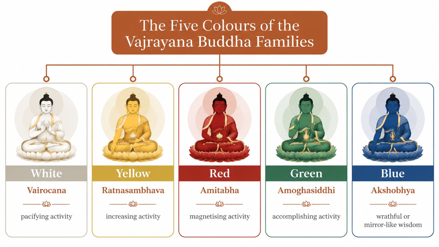
Think of the five Buddha families as households. The family is the household, the colour is the badge on the door, and the activity is the job the household does. That's the most useful way to hold the system in your head, because it stops colour from floating free as a mood and ties it to a function.
The University of Wales Trinity Saint David's resource on Vajrayana ritual sets out the identification system as follows: white with Vairocana and pacifying activity, yellow with Ratnasambhava and increasing activity, red with Amitabha and attracting activity, green with Amoghasiddhi and repelling activity, and blue with Akshobhya and the uncommon or exceptional siddhi.
What each colour identifies
- White, Vairocana, pacifying. Calming obstacles and illness. The colour of quiet, steadying rites.
- Yellow, Ratnasambhava, increasing. Growth, merit, long life and prosperity. A yellow figure is usually being asked for more of something.
- Red, Amitabha, attracting. Magnetising and drawing in. Red is the colour of devotion and of the pull toward the Pure Land.
- Green, Amoghasiddhi, repelling. Turning away harm, and the activity traditionally associated with Green Tara.
- Blue, Akshobhya, the uncommon siddhi. Blue sits outside the four ordinary activities, which is why it reads differently from the rest of the set.
A worked example from the V&A
A lama's crown in the Victoria and Albert Museum gives the system a body. Its record of the crown plaques describes four surviving plaques from a set originally made up of five, representing Amitabha, Ratnasambhava, Vairocana and Akshobhya, coloured red, yellow, blue and white and shown in meditative, bestowing, teaching and witness attitudes. The object was worn during a long-life service, the obtaining of long life.
Note what the museum record does with the colours: it puts blue on Vairocana and white on Akshobhya, the reverse of the scheme above. That isn't a mistake to correct. It's a reminder that a surviving object records one workshop's arrangement, while a summary table records one scholarly convention.
Where the scheme changes
The five colours also carry directions, and the directions aren't fixed either. A Kent Academic Repository thesis on Buddhist ritual records a Vajrayana arrangement with blue at the centre, white in the east, yellow in the south, red in the west and green in the north, and links yellow and the Ratna family to increasing activity. The same source sets out a ritual correspondence where pacifying uses a circular white hearth, increasing a square yellow hearth, subduing a semicircular red hearth and destroying a triangular black hearth, which is why black belongs in any honest list even though it appears in so few of them.
| Colour | Buddha family | Associated activity | Kent thesis direction |
|---|---|---|---|
| White | Vairocana | Pacifying | East |
| Yellow | Ratnasambhava | Increasing | South |
| Red | Amitabha | Attracting | West |
| Green | Amoghasiddhi | Repelling | North |
| Blue | Akshobhya | Uncommon or exceptional siddhi | Centre |
To confirm a family assignment, check four things together: the colour, the hand gesture, the posture and any accompanying Buddha figure. Hand gestures and posture usually fix identity more reliably than hue alone, and a repainted surface can undo the colour evidence entirely. The guide to the five cosmic Buddhas is a useful companion once you can read the badge and the job together.
Reading Colour in Burmese Lacquerware
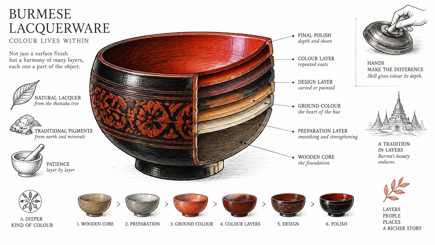
Lacquerware is where colour stops being a symbol and becomes structure. The sap is built up in thin coats over a bamboo, wood or woven core, each coat cured in humid air before the next, so the ground colour is part of the object's body rather than a skin laid on top. Scrape or incise through that ground and you reach the layers beneath, which is how much of the finest detail is made.
Think of it as a stage set. A red or black backdrop pushes the gilded or painted figure forward, and the drama comes from the depth between them rather than from either colour alone.
Ground, detail, repair, use
Ground colour sets the register. Red and black grounds dominate much Burmese lacquer, and the choice often tracks an object's purpose rather than a doctrine, since offering vessels, boxes and panels came out of different workshops and different commissions.
Gilded relief and painted detail carry the storytelling. Gold leaf on a red ground reads as radiance, and the same gold on black reads as something more austere, so note which ground you're seeing before you interpret the shine.
Repair and repainting are where meaning changes. Later gilding, retouched red and modern synthetic colourants can shift a piece from one visual register to another, and a heavily restored vessel may look closer to a temple object than it ever did.
Use is the evidence most often lost. An offering vessel, a betel box and a decorative panel share a palette but not a function, and function is what tells you how seriously to take the colour scheme.
For a piece you're considering, ask four questions: what is the ground colour, is the gilding original, which layers have been repaired, and what was the object used for. Record the answers with the object, alongside its measurements and any inscription, and keep that note with your display label. Our collection of Burmese lacquerware shows the range of forms the palette appears on, from ritual vessels to panels.
How to Read and Display Colour in Sculptures
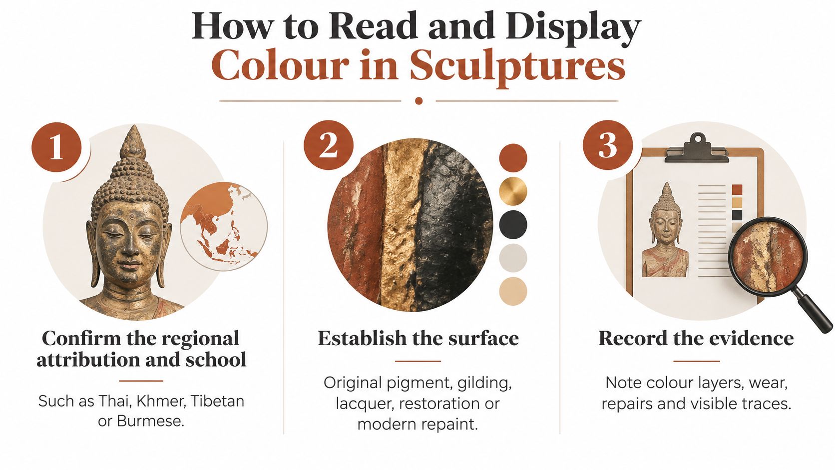
A painted or gilded sculpture is the hardest object to read, because so much of its colour has already been lost, restored or invented. Work through these six steps in order and you'll avoid most of the errors that single-colour labels create.
Six steps for reading a painted surface
- Confirm the regional attribution and school. Thai, Khmer, Tibetan and Burmese workshops used different palettes and different conventions, so the school comes before the colour.
- Establish the surface. Decide whether you're looking at original pigment, gilding, lacquer, later restoration or a modern repaint. Each one changes what the colour can tell you.
- Record the full colour network. Note the ground, body colour, robe, ornament, attribute and outline separately rather than labelling the piece with one hue.
- Examine the halo, mandorla and lotus base. These carry colour meaning of their own, and they're often better preserved than the face.
- Read the iconography. Hand gestures and posture fix identity more reliably than colour alone.
- Check condition. Fading, flaking and old varnish shift tones, and a blue that reads grey may once have been vivid.
British Museum technical documentation shows why step two matters so much. In one Japanese esoteric example, gold was applied beneath coloured areas to intensify luminosity, white skin was produced through an underside silk-transfer technique, and vermilion replaced black in selected outlines to heighten emphasis around the crown and eyes, choices documented in the museum's guide to its Korean and East Asian Buddhist painting. Pigment selection and layering control hierarchy, durability and the perceived radiance of the figure, so a red or blue element may encode doctrine or reflect mineral availability, workshop habit, pigment ageing or the need for contrast against a dark ground.
Composition does the rest. A British Museum Amitabha Sutra manuscript written in gold and silver on indigo-dyed paper shows how contrast carries meaning: the dark ground lifts the metallic script into brilliance, while surrounding vajra and wheel symbols anchor that radiance in doctrine. The same principle applies to sculpture, where a halo's repetition of the body colour, the ornaments around it and the outline all work together.
Choosing light without inventing meaning
Display decisions change perception, and it's worth being honest about that. A 2025 observational experiment with 116 participants found that white lighting produced the highest ratings for sacredness, perceived value and authenticity when viewing a Buddha statue, while yellow scored highly for memorability and sacredness and blue scored lowest for authenticity and formality, as reported in research on how lighting affects the perception of Buddhist art. That study took place in Thailand, not Britain, but the question transfers directly.
Display rule: choose neutral light where authenticity matters most, and warmer light where you're building atmosphere. Neither adds religious meaning to the object. They change what a viewer sees.
For a home altar or a gallery case, that means checking the piece under neutral light first, photographing it there, and only then deciding on warmth. Keep a Buddha statue clean, raised from the floor and away from bathrooms, cluttered areas or anywhere it may be treated casually. Before you buy, ask for the tradition, the object type and the pigment evidence, and expect the paperwork to name them. Every statue we sell comes with a description that sets out its stylistic origin, such as Khmer, Thai or Indian school, whether it's antique, vintage or a contemporary piece inspired by historic temple art, and what the pose and mudra signify, so you can read the colour against the right tradition rather than against a chart.
Reading colour in Buddhist art comes down to evidence, and the right description is half of it. HD Asian Art catalogues Buddha statues by region, from Burma and Cambodia to Japan and Sri Lanka, alongside Hindu deity sculptures and Burmese lacquerware, with each piece described by school, pose and mudra so you know what you're looking at before it arrives. Browse the collection by country, deity or material, and start your next acquisition from the tradition rather than the colour chart.
